310 search results
(0.022 seconds)
- Kotomi Display by The Paper Town,
$26.00 Kotomi Display is a high contrast all-caps serif font with an elegant calligraphic touch. Inspired by didones, it features thin bracketed serifs, sleek lines, proportioned curves, angled axis...all, with a sense of fashion. Designed for high end branding, Kotomi Display is intended for large titles and big headers where its sharp and refined finish is particularly appreciated. The font is equipped with beautiful alternates and countless ligature variations that flows in harmoniously to achieve a well balanced combination and a legible composition. With a set of 1414 glyphs, Kotomi Display can serve a wide range of projects from editorial to branding, logos, posters, magazines, blog titles, packaging, wedding invitations, social media and more. Included case sensitive punctuation, numerals, symbols and multilingual support for western, central and south east European languages. Caps Only Fonts.
 - Ooky - Unknown license

- Noki by ActiveSphere,
$30.00 The new release is called Noki. A font family Ideal for flyers, label, logos, magazine, product branding, corporate branding, signage, posters and certainly in advertising. Check it out !
 - Moki by FaceType,
$25.00 The seven ways of Moki. Moki comes in seven different styles: Base, Cut, Dust, Lean, Mono, Soft and Uni. Moki is a display expert – with a wide range of languages covered, the family offers a style for every purpose. You are a SciFi movie director and are looking for an alternative to the inevitable Eurostile? Now you have!
 - Bokis by Sign Studio,
$10.00 Bokis is a sans serif family that has simple and strong characters. This font will provide a confident and impressive base headline to any of your designs. Balance on each side is well maintained. It's ideal for headlines, titles, posters, branding, and logotypes that require big impact.
 - Notorious by W Type Foundry,
$15.00 Notorious is a brush script typeface with features that come from gestural calligraphy plus a touch of personality, therefore, it delivers wider freedom in both rhythm and composition of words. As a result, this typeface is highly suitable to convey expression in a most natural way. Notorious is composed by two styles; the first one is black and the other one textured. Both generate a more natural look when it comes to writing. Every weight includes alternative characters, ligatures, numbers, final forms, swashes, extras and catchwords giving you more options in terms of fostering your creativity. If you are looking to create expressive and gestural messages Notorious is your ideal choice.
 - Cotoris by Dharma Type,
$19.99 Cotoris is beautiful glyphic sans serif. This font includes ligatures and small caps for advanced typography which are accessible by OpenType features. Highly effective where a graceful and feminine design is desired. Rising Star on June 2007.
 - Totoey by MKGD,
$13.00 Most of my fonts tend to skew more to the darker side in terms of themes and uses. So, as a challenge, I took it upon myself to design a font through the eyes of my wife. Josephine, having a sunny and carefree disposition, gave this font her blessing as being certifiably fun and cheerful. The name of the font comes from the Cantonese translation for "peach" (tow); and saying it twice (toto) is just a cuter way of putting it. Sort of like "Peachy". It's been my nickname for Josephine for as long as I can remember. Totoey has a glyph count of 390 and supports the following languages; Supported Languages: Afrikaans, Albanian, Asu, Basque, Bemba, Bena, Bosnian, Catalan, Chiga, Colognian, Cornish, Croatian, Czech, Danish, Embu, English, Esperanto, Estonian, Faroese, Filipino, Finnish, French, Friulian, Galician, German, Gusii, Hungarian, Icelandic, Indonesian, Irish, Italian, Kabuverdianu, Kalaallisut, Kalenjin, Kamba, Kikuyu, Kinyarwanda, Latvian, Lithuanian, Low German, Lower Sorbian, Luo, Luxembourgish, Luyia, Machame, Makhuwa-Meetto, Makonde, Malagasy, Malay, Maltese, Manx, Meru, Morisyen, North Ndebele, Norwegian Bokmål, Norwegian Nynorsk, Nyankole, Oromo, Polish, Portuguese, Romanian, Romansh, Rombo, Rundi, Rwa, Samburu, Sango, Sangu, Scottish Gaelic, Sena, Shambala, Shona, Slovak, Slovenian, Soga, Somali, Spanish, Swahili, Swedish, Swiss German, Taita, Teso, Turkmen, Upper Sorbian, Vunjo, Walser, Zulu
 - Kitami by Talbot Type,
$19.50Talbot Type Kitami is a minimal, geometric, stencil display font, inspired by Herbert Bayer’s Universal Typeface, created at the Bauhaus in the 1920s. Each character is created from a single continuous stroke, or combination of strokes. - Kosumi by Thinkdust,
$10.00 Kosumi is an experimental display typeface. Its juxtaposition of thick and thin catches that gleam in your eye, and leads you by the hand out of your comfort zone with such ease that you'll never look back. Kosumi is comfortable in any of a thousand different places, looking brilliant on posters, and reigning supreme within magazine spreads. All you need to do is let is whisk you away. The eye-catching differences between thick and thin lines serve to capitalise your attention, ensuring your nicely laid out headline is truly the star of the show!
 - Nozomi by JprintStudio,
$15.00 Nozomi is a cute and casual handwritten font with an incredibly friendly feel. Whether you’re looking for fonts for Instagram or calligraphy scripts for DIY projects, this font will turn any creative idea into a true piece of art!
 - Kokomo by Hanoded,
$20.00 Kokomo is a beautiful handmade contoured font - which was drawn with an old-fashioned steel pen and Chinese ink. The open, shadowed letters are great for posters and ads. Kokomo comes with extensive language support and has an alternative lower case a, for those who don't like the one I used.
 - Doki Doki Tokimeki by Megami Studios,
$12.50 Designed with visual novels and romantic text in mind, Doki Doki Tokimeki (taken from the Japanese sound for a heartbeat and the word heartbeat itself) is a romantically-inclined sans serif. From playful, yet friendly letters to a range of dingbats and a series of alternate heart-shaped glyphs, it’s sure to make your heart go pitter-patter as well!
 - Otomo by The Northern Block,
$18.00 A super wide san serif typeface inspired by event graphics for Sheffield music venues in the 1990s. Most influential work by The Designers Republic (TDR). Details include four unique styles, extended European character set, manually edited kerning and Euro symbol.
 - HoTom by Linotype,
$29.99Linotype Ho Tom is part of the Take Type Library, which features winners of Linotype’s International Digital Type Design Contest from 1994 to 1997. Designed by Thomas Hoffman, this font’s historical roots are easily traced to the slab serif style. Ho Tom was originally intended as a lettering system for a project in the center of the old East Berlin. This explains the stable, angular characters and the consistent rectangular base forms, which also makes Ho Tom a very legible font, suitable for longer texts. - Loki Cola - Unknown license

- Solid Ooky - Unknown license

- Altogether Ooky by Comicraft,
$19.00 It’s Creepy and it’s Kooky, it’s Altogether Ooky! Created by Comicraft’s Festering Fontmeister, John Roshell, for “The New Addams Family” TV series, Altogether Ooky is just The Thing you'll be looking for when Gomez and Morticia come knocking at your door.
 - Yotamy MF by Masterfont,
$59.00 The geometric nature of this font family makes is suitable for presentations, headline and any other formal usage.
 - Kokomo Breeze by Nicky Laatz,
$35.00 Say hello to Kokomo Breeze - A deliciously bold and nonchalant casual marker font. Kokomo Breeze was designed to keep a naturally handwritten marker-style look , while still maintaining some subtle inky marker imperfections on its edges , to keep in line with a more realistic, yet very legible look. Great for headlines, bold branding, classy packaging, eye-catching callouts and stand-out advertising, Kokomo Breeze is designed to be your jack of many trades. Be sure to turn on your OpenType features when type with Kokomo Breeze - it’s packed with natural-looking ligatures and alternate characters for both upper and lower case - all of these opentype extras make your type design look mush less mechanical, and much more like naturally formed words as you type. Pair it with a bold tall sans serif font, or a classy serif to add another whole new dimension to this very versatile marker font. Great as large and small sizes, Kokomo Breeze is perfect for any size design.
 - Attomi Gilbert by Motokiwo,
$16.00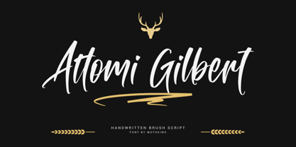 Organic handwriting gesture from a cool brush that useful for multipurpose projects. This is Attomi Gilbert, an elegant script font with passionate handmade feels in each characters. You can use it for vintage or urban projects style. Features: Ligatures Swashes Access All Alternates Special Characters (Multilingual) PUA Encoded
 - Semarang Kolonial by Hanoded,
$15.00 Semarang Kolonial is a stylish, all caps Art Deco font. It is not a recreation of a particular typeface; merely my salute to a bygone era and to the birthplace of my father in law, who recently passed away. Semarang Kolonial goes well with the original Semarang font.
 - Kooky BT by Bitstream,
$57.99Allen Zuk has designed this wacky typeface that he calls KOOKY. Each character has three variants that bounce about the baseline. The effect is a randomly casual appearance that is great for headlines. The OpenType version does this automatically by using contextual alternates in applications that recognize this option. - LD Kooky by Illustration Ink,
$3.00This kooky font has thick bold style letter. They are slightly toggled to give it a fun look. You will enjoy this one. - Kookies MF by Masterfont,
$59.00 - KR Ookie Bookie - Unknown license

- Otome Mincyou by Norio Kanisawa,
$50.00 This font is I thought "I wanna try to make cute Mincyoutai.", and made it. I think it is cute font but may have a little nostalgia. It corresponds to Hiragana · Katakana · Alphabet · Numerals · Symbols · Kanji(chinese characters). You can also write vertically. You can use it easily, because it contains JIS first · second level, and IBM extended Kanji(about 6700chinese characters). Since it is little bold Mincyoutai, I think it is useful for headlines and text. About it's name, it is simple but has some childhood and romantic, I named this font "OtomeMincyou". I'm hope you like it. <「乙女みんちょう」紹介文> 「かわいい明朝体を作ってみたい!」と思い作ったフォントです。 かわいい中にもどこか懐かしさを持ったフォントになったかと思います。 ひらがな・カタカナ・アルファベット・数字・記号類・漢字に対応。縦書きもできます。 漢字はJIS第一水準・第二水準・IBM拡張漢字(約6700文字)に対応しているので、使いやすいかと思います。 ちょっと太めの明朝体なので、本文にも見出しにも使えると思います。 名称については、シンプルだけども夢見る少女のような幼さ・ロマンチックさを持っているなぁと思ったので「乙女みんちょう」と名付けました。 皆様のお役に立てれば幸いです。 <スタイルカテゴリー> 明朝体、装飾
 - MVB Emmascript by MVB,
$39.00Kanna Aoki drew the letters for MVB Emmascript while on a picnic near the Conservatory of Flowers in San Francisco’s Golden Gate Park. Mark van Bronkhorst adapted the writing as a font that maintains a very natural scrawl. Later a bold weight was added. MVB Emmascript has been used to add a lighthearted, human touch to everything from fiction paperbacks to potato chip packaging. The typeface is named for Aoki's 1968 Volkswagen, Emma. - MVB Hotsy Totsy by MVB,
$39.00MVB Hotsy Totsy is Akemi Aoki’s first typeface design. Aoki created the letters in cut paper. Once digitized, the design was expanded to offer several weights and styles. Exaggerating the triangular serifs and tapering strokes of “Latin” typefaces, MVB Hotsy Totsy is the perfect party face, appearing frequently on board games, product packaging, and in children’s books. It is named for (what was at the time) a dive bar in Albany, California. The bar has since been renovated but its neon sign was preserved, a local landmark of San Francisco’s East Bay. - AddJazz - Unknown license

- AddSpeedy - Unknown license

- MVB Cafe Mimi by MVB,
$39.00Kanna Aoki was designing fabrics and dishware for several major manufacturers when she designed MVB Cafe Mimi. The design came from a few words Aoki painted as decoration for a set of cappuccino cups. Aoki created the Regular weight for MVB Fonts using a brush. The Bold was adapted after digitization. Using several double-letter ligatures, the fonts can feel as natural and spontaneous as the original hand-painted lettering. Despite its curlicues and free-flowing forms, great care was taken to keep this script balanced and legible. It skips and hops along the baseline but doesn't lose its step. - Choujun - Unknown license

- AddCityboy - Unknown license

- AddLoops - Unknown license

- Hob Gob NF by Nick's Fonts,
$10.00Although not credited, the inspiration for this typeface, originally called "Dancer", has all the earmarks of the work of legendary lettering artist Alf Becker. Creepy and kooky, mysterious and spooky, but not in the least ooky, this monocase face is just what the doctor ordered; Dr Frankenstein, that is. Both versions of this font include the complete Unicode Latin 1252 and Central European 1250 character sets. - Mael - Unknown license

- MVB Aunt Mildred by MVB,
$39.00 MVB Aunt Mildred has a vintage charm that evokes hand-lettered postcards or advertising. Akemi Aoki drew the letterforms with a fine-tip felt pen and named it after her great aunt. Since its release in 1995, Aunt Mildred has been a popular choice for children’s books. Italics and bold weights have been added, making it even more useful for publications, packaging, and greetings of all sorts.
 - MVB Greymantle by MVB,
$39.00Kanna Aoki had fairy tales in mind when she designed MVB Greymantle. She drew dots with a felt pen to build up the forms, giving them their particular rough character. The “Extras” font contains a set of whimsical illustrations, including a portrait of Greymantle—her 18-pound cat, a set of curly initial caps, and border parts. MVB Greymantle has been spotted on numerous children's books, in magazines, in salad dressing advertisements, and on food packaging. - MVB Fantabular by MVB,
$39.00MVB Fantabular proves that monospaced faces needn’t be formal or bland. Inspired by the letterforms of older typewriters, Akemi Aoki designed a playful family of three weights with italics. With every character the same width MVB Fantabular works wherever a monospaced font is needed, but the face is so loose and carefree it hides its fixed pitch construction well, allowing it to be used in other settings too. A sans serif version—MVB Fantabular Sans—is also available.


Page 1 of 8Next page